Design revisions... for the most part


#13
 09-05-2005, 11:54 PM
Senior Administrator
Join Date: Feb 2005
Location: Lotsa places, currently Metro D.C., USA
Posts: 13,574
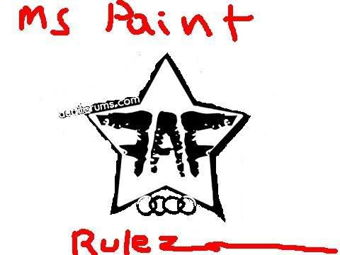
I realize Im in the minority (i'm used to it, tho), but I'm not feelin the star, at all. I'm more of a minimalist... It shud be made as simple as possible, and NO simpler
#14
09-06-2005, 12:16 AM

I like #4... for some reason, I think the rings have to be changed... they look to clean. THe rest of the logo thing is soo bad ***... and the rings look to clean. But i mean, how do ya change 'em eh!? HMMM.


#16
09-06-2005, 01:26 AM

i like the fourth one w/o the star, maybe just move the "audiforum" letters to go slightly through the first letter of the logo, the top of the backwards F
#17
09-06-2005, 01:39 AM
Maybe, if you took # 4... and moved the rings so they are juxtaposed to the "audiforums.com" thing.
I dunno!
I dunno!
#18
09-09-2005, 07:49 AM

Still obsessed with an extra F... I know it looks good, but people will ask what the first F is for. And we will all have to answer.. "erm..well.. its a design thing you see.. symmetricl, and all that. Its means nothing... 3 letters, 2 words...ahem.. cough", and so on...
#19
09-09-2005, 08:34 AM

ORIGINAL: EvilA4
True, true! It is a bit bold... and heavy. Ill mess around with other designs.
Keep in mind... if the star is thinner... the audi rings will not fit and could be unreadable.
ORIGINAL: rs
looks good. like the 4th and 1st logos. altho i think the star would look better if it was a wee bit thinner, no? then where the rings arent in the stripe of the star, invert the colour..
just a thought, looks good tho
looks good. like the 4th and 1st logos. altho i think the star would look better if it was a wee bit thinner, no? then where the rings arent in the stripe of the star, invert the colour..
just a thought, looks good tho
True, true! It is a bit bold... and heavy. Ill mess around with other designs.
Keep in mind... if the star is thinner... the audi rings will not fit and could be unreadable.